

Sorcerer To The Crown
The image doesn't do it justice, but if you haven't seen a hard copy of this book, it's gold foil on a black book and looks absolutely stunning! I'm more than a little magpie-esque, shiny things immediately attract my attention, and the incredibly intricate detailing is utterly gorgeous. It was the sole reason for me picking up this book (the blurb sold it to me!). I haven't read it yet but fantasy, magic and old timey England, what's not to love?

Snow Like Ashes/Ice Like Fire
I'm (im)patiently waiting for my hard copy of Snow Like Ashes to arrive (due tomorrow!) but I'm already in love with the covers of both it and the sequel. The gateway to the other worlds is beautiful and the contrast just gorgeous.

The Wrath And The Dawn
I've just started this book but I'm already hooked by the intriguing cover. There's something about the cover that just gets me. I don't know if it's the colour, the patterns, the girl's clothes and jewelry, what it is, but it just conjures up all sorts of images of exotic, far away lands and at the same time makes me immediately want to start reading. Who's the girl? Who is she watching? Why is she hiding? Who's watching her?

Queen Of The Tearling
Simple, yet effective. This image is so powerful on its own that I'd personally prefer the blurb and recommendation to be dropped entirely. The UK version in my opinion is so much better than the US version which is a far more generic fantasy book sort of cover. Out of interest, anyone know why publishers go for different US/UK covers? One is always miles better than the other and I always wonder why publishers don't just use the best cover everywhere.

Red Queen
Another simple yet striking image (the covers for Glass Sword and Queen's Song are equally stark and gorgeous), the bright red blood on the silver crown is nice intro to the reds vs the silvers theme in the book. Beauty and danger, promise and threat, it's the kind of visual juxtaposition that I just love.

The Sin Eater's Daughter
I love this book (and the recent cover reveal for the sequel The Sleeping Prince is equally dreamy) and the cover. I can't quite put my finger on what I love so much about this cover, maybe it's the whole thing. The colour combinations, the girl in the jar, the swirls in the water, I just love it. Again, this is another one of those books with a different (albeit ever so slightly) US/UK cover which puzzles me. Don't mess with perfection!
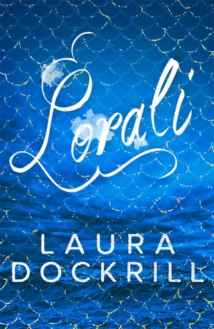
Lorali
In a word; beautiful! From the font to the seascape to the iridescent scales, I fell in love with this book the moment I set eyes on it (and happily the book turned out to be fantastic).
Any other bookworms out there as shallow as I am? Does cover art matter to you at all when you're buying and choosing what to read? What are some of your beautiful book favourites? Let me know in the comments!
It matters perhaps too much to me ahah, I will buy a book on kindle or paperback/hardcover depending on the cover and even then it has to be the right edition! In the past I've bought books with no idea what they were about - they were simply beautiful and so I couldn't resist
ReplyDeleteAll the ones you pictured are amazing <3 (I also don't understand why they have different covers for US & UK)
Enchanted by YA: http://enchantedbyya.blogspot.co.uk/2015/10/fall-time-cozy-time-book-tag.html
I'm glad it's not just me, I literally bought Lorali because it was so pretty! There was a quite interesting blog post over on the Tor UK website about why they use different covers in different markets.
Deletehttp://www.torbooks.co.uk/blog/2015/10/13/truthwitch-uk-cover-reveal
Book covers are definitely something that draws me to the book initially, but after reading the synopsis I need to feel that connection, haha :) I love the first cover!
ReplyDeleteFlorentine @ Readiculously Peachy
It's even more gorgeous in real life! I spent entirely too long tilting it this way and that in the bookshop to admire the shininess. I pretty much had to buy it after that or I'd have looked even stranger than I did.
DeleteCovers are definitely important. Cooney's What Child is This has two editions, and the white cover just doesn't do the story justice like the blue one does.
ReplyDeleteI of course immediately googled this! It's interesting how the cover art makes it look like two entirely different stories, the cover looks almost like a children's story whereas the blue one is pure thriller territory. Almost like those movies where the trailer markets it to be one thing and it turns out to be something else entirely.
Delete